AnalogFolk / Diageo · 2024–2026
Illustrating alcohol without glorifying or vilifying it.
DrinkIQ is Diageo's responsible drinking platform, built to help people make informed choices about alcohol. AnalogFolk brought me in late 2024 to define the illustration style for the rebrand, covering content that photography couldn't carry.

The Context
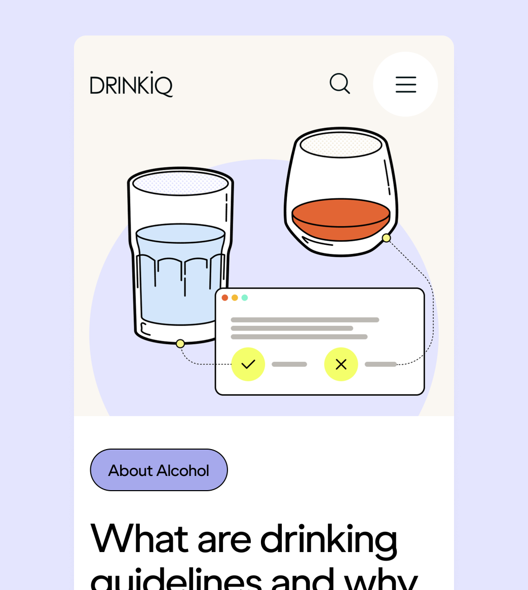
DrinkIQ exists to inform, not to sell. But alcohol illustration has a dominant visual vocabulary: warm tones, golden light, condensation on glass. Going anywhere near it would undermine the platform's purpose. The opposite extreme, clinical diagrams or cautionary imagery, would feel preachy, which is equally wrong for a brand that treats its audience as adults. The question was how to show alcohol honestly, without glorifying it or vilifying it.
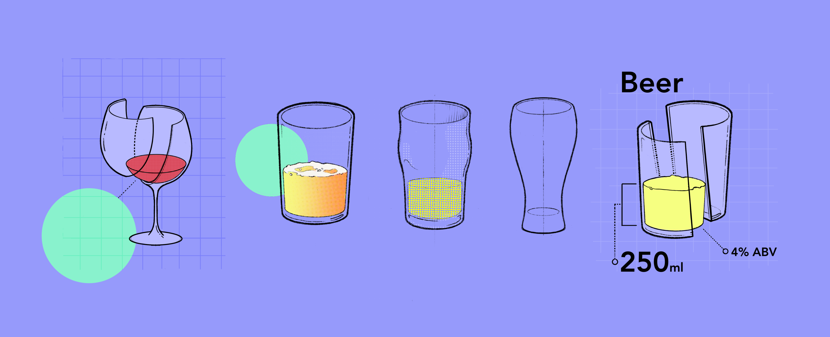
The Decision [1]
Instruction manual, not advertising. Technical illustration was the answer, clear, neutral, precise. Not isometric, which risks reading as gamified, but a straightforward perspective that keeps things grounded. Given the precise scope, we kept it to objects only, no characters.
The Decision [2]
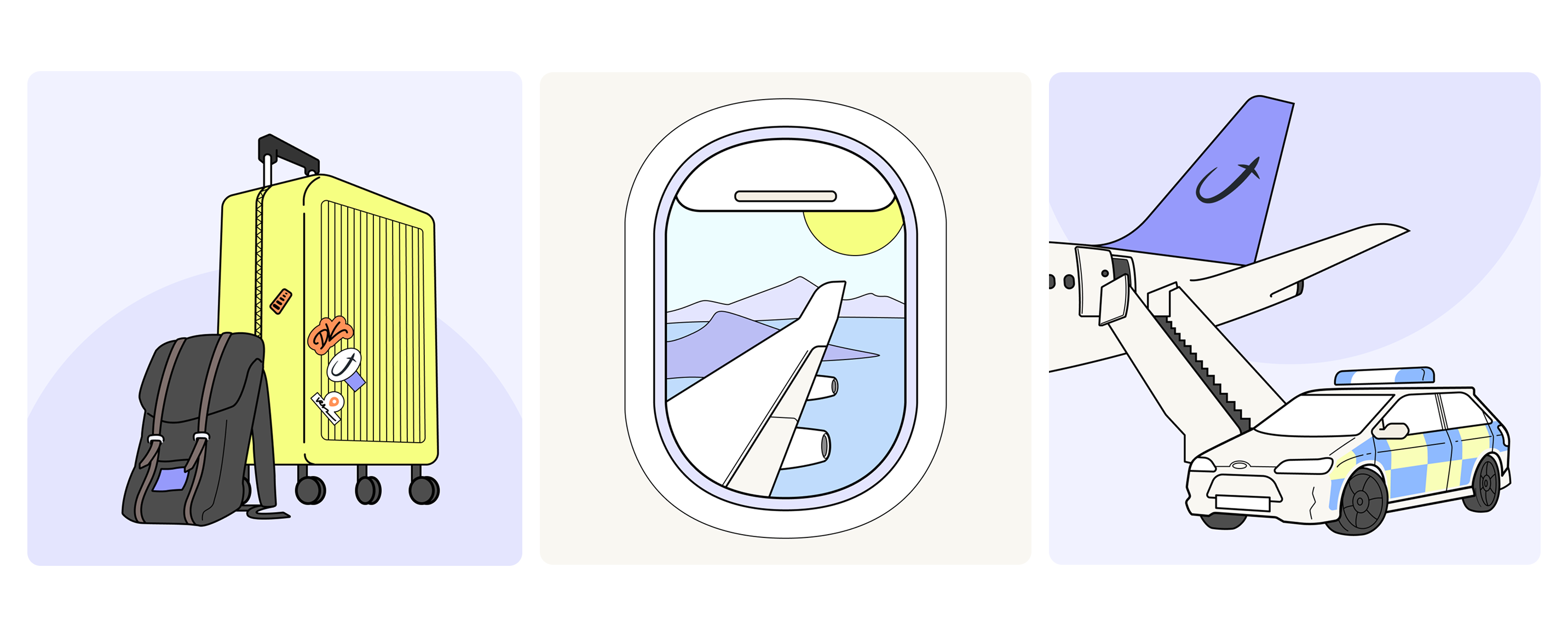
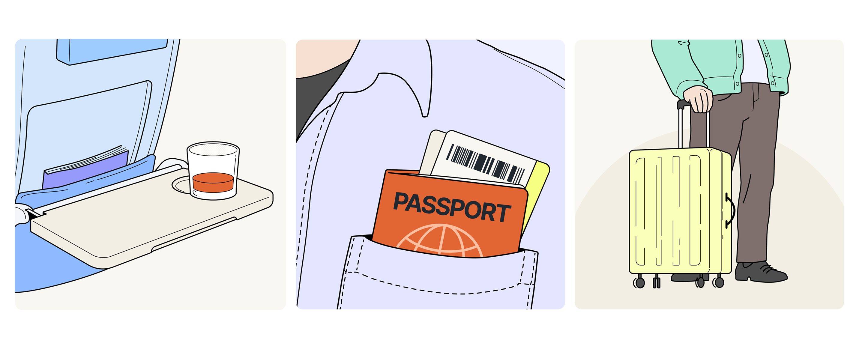
In early 2026, Diageo came back with a new brief: a travel quiz for airline partners. Now scenes and characters were necessary. A stylised character, the way IKEA instruction manuals do it, would have pulled the figures into a different register from the objects. Instead, I looked at aviation safety cards, realistic vector outlines, no expression, no personality. The same logic as the drinks and bottles, just applied to people.

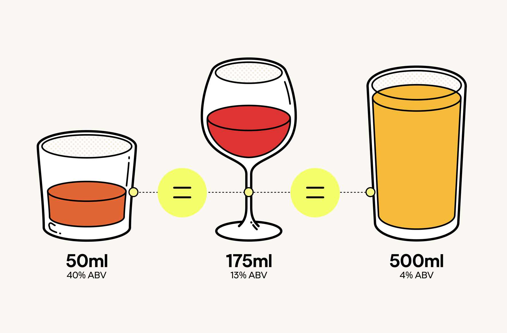
The Work [1]
The objects sit in an open field. No ground plane, no depth cues. Each illustration floats in space, anchored only by a soft circle that runs consistently across the series. It keeps the system coherent without making it feel templated.
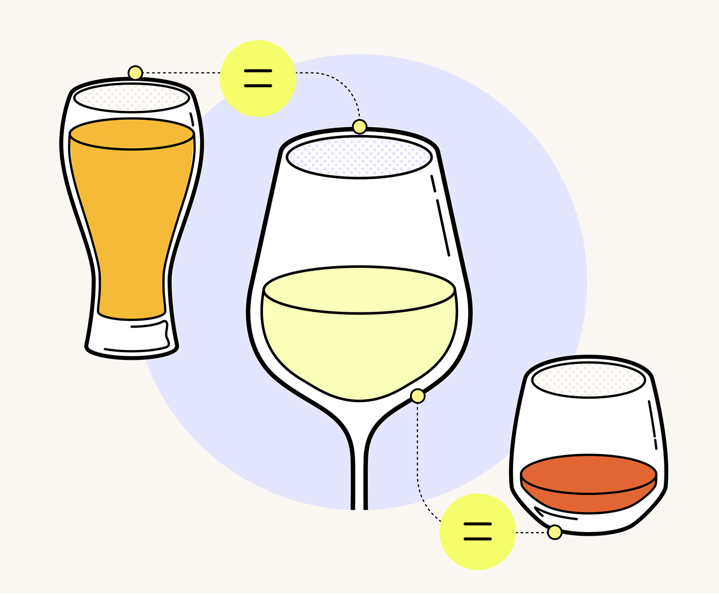

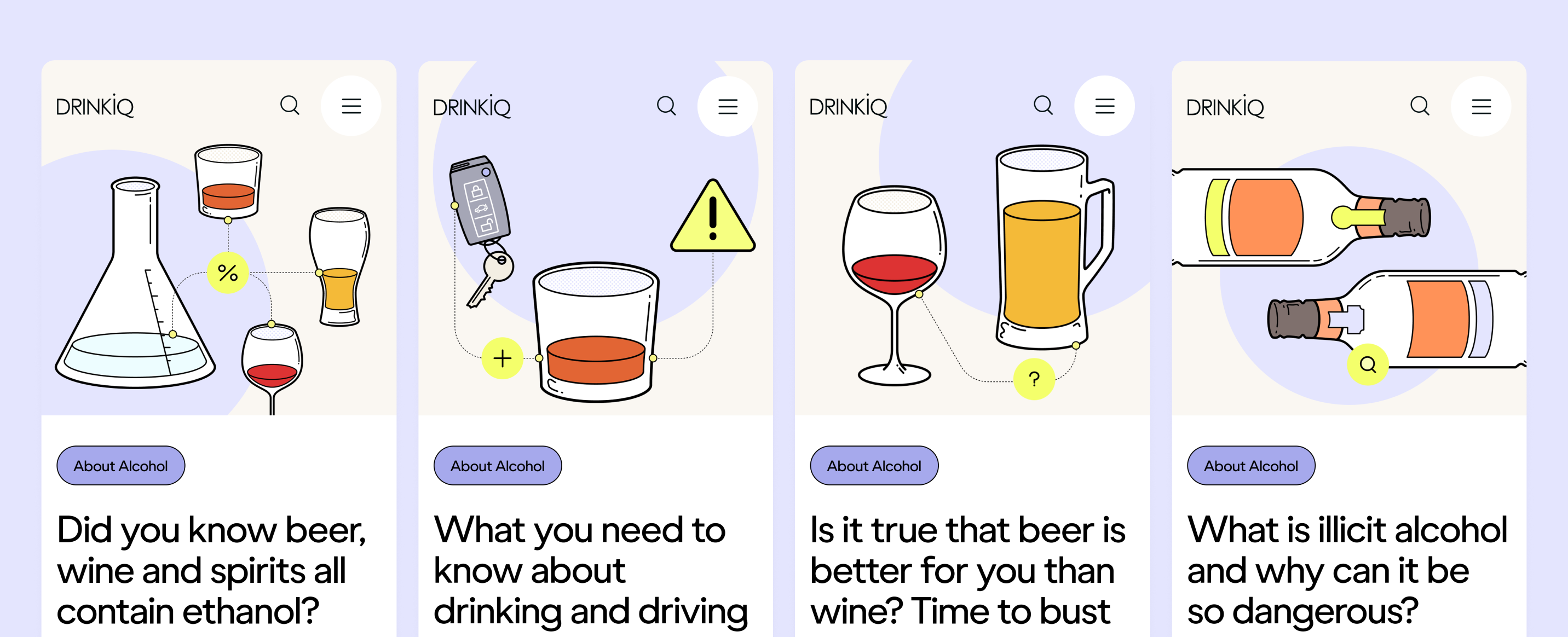
The Work [2]
The original set operates at a narrow scale: glasses, bottles, measurements side by side. The travel series stretched this considerably, from a close-up to an out-the-window view. As the scenes grew more complex, the circle started becoming visual noise rather than an anchor, so we drew a deliberate line. The most narrative scenes stand without it.
The Landing
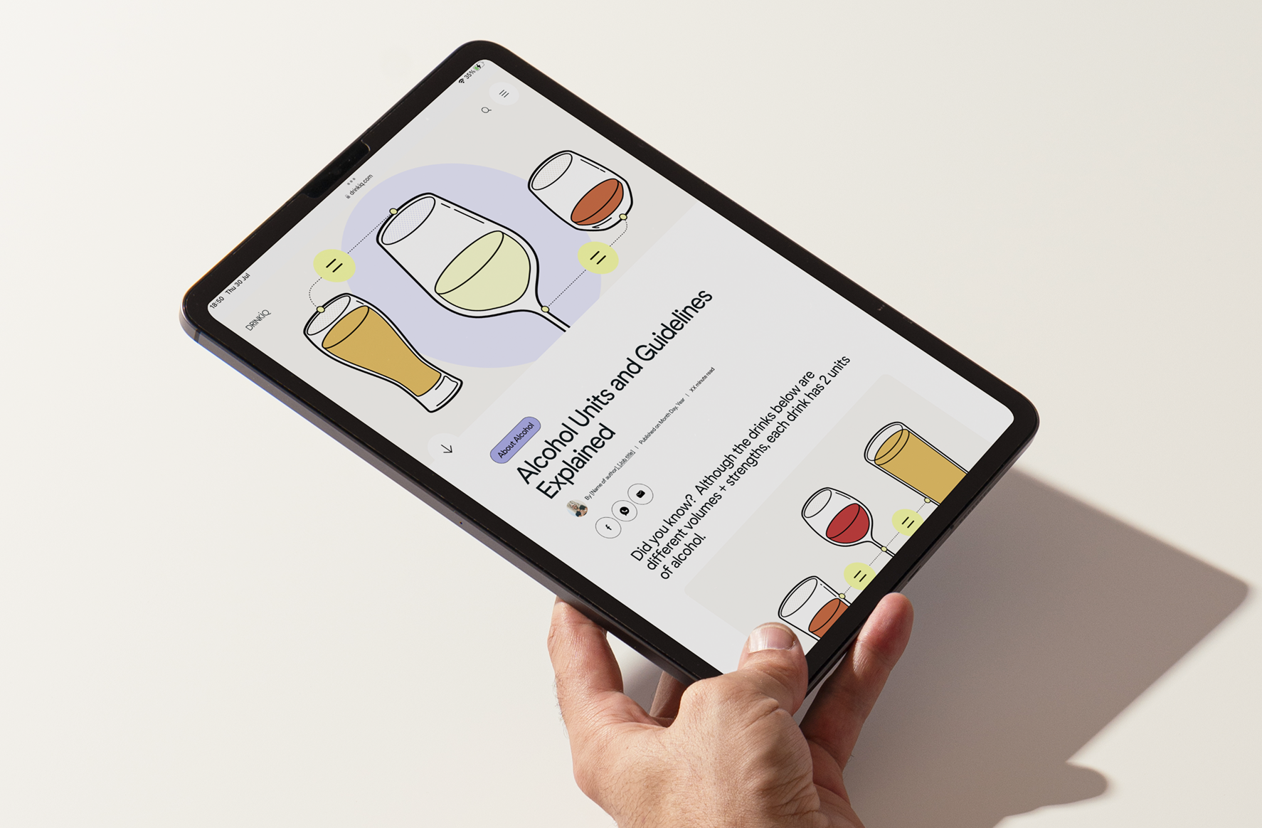
The illustrations are a permanent part of DrinkIQ, living across the site's articles, the quiz, and campaign materials. The style was adapted by other illustrators and animation studios after the handover. That it was adopted cleanly by other creatives without reinvention is probably the clearest sign that the system was built on a solid idea.
Got an idea? Let's craft it into a story, bad jokes welcome.
2024 · Re·silent
Imagining what a truly kind brand looks like