Re·silent · 2024
Imagining what a truly kind brand looks like
Re·silent is a passion project, not client work. I wanted to explore, no brief, no committee, no brand guidelines to inherit. But I also didn't want to design in a vacuum, so I built a real business concept to solve for. A mental health app that connects users with licensed therapists, backed by a social enterprise where profits fund awareness campaigns.
The Context
Total freedom is its own kind of problem. You have to build the walls before you can push against them. So I looked to the real world. In the mental health space, we either have charities that struggle for funding or companies that seem too focused on pushing their product. The business model I imagined for Re·silent was my solution: what if the app's revenue funded social campaigns instead of product ads?
The Decisions [1]
I wanted Resilience to feel warm and human. So I chose a humanist sans serif “Geigy LL”. Inspired by pre-Helvetica era hand-drawn posters, paired with Agresta, an elegant italic serif. For illustration and animation, I rejected vectors and went hand-drawn. The colour palette follows the golden-hour warmth of the photography. Every choice pointed in the same direction: towards craft, slowness, and the human process.
The Decisions [2]
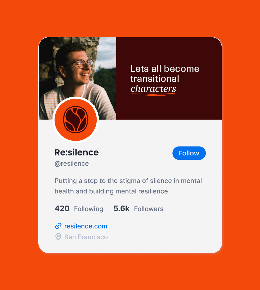
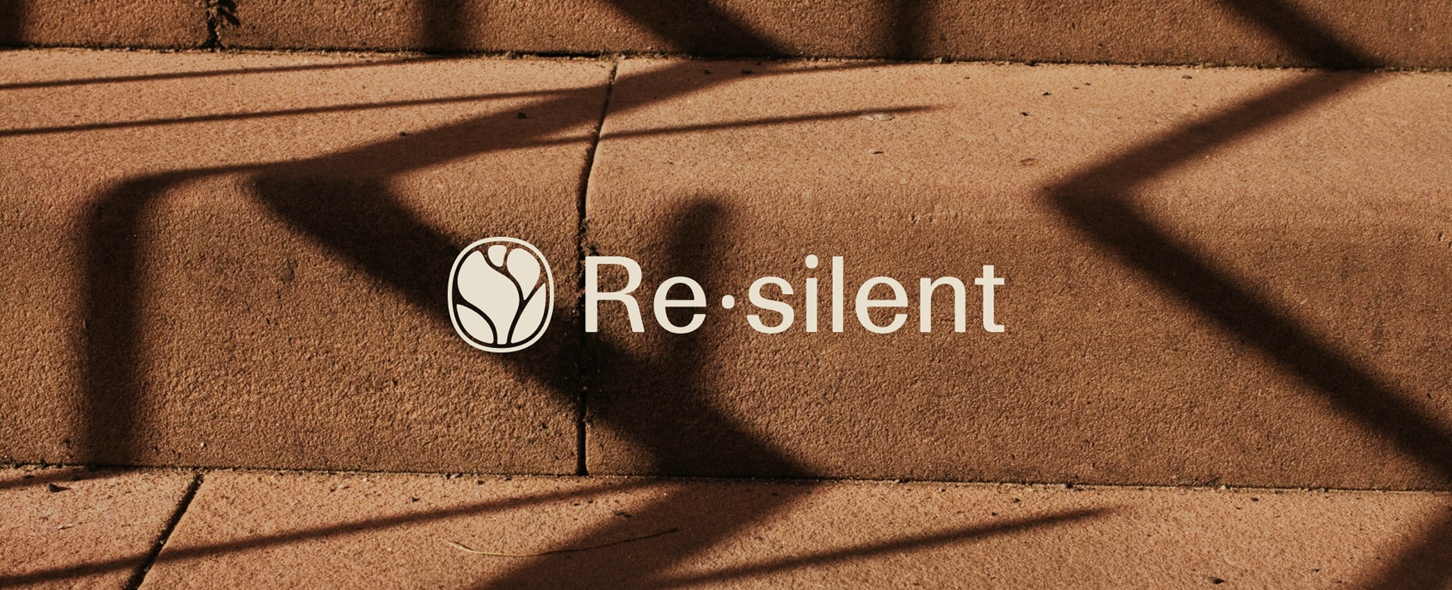
The name Re·silent plays on resilience and breaking silence, two ideas at the heart of the concept. I initially planed a word-mark that would highlight that wordplay, but it felt to tech and quirky. So I designed an abstract logo icon, based on the crocus flower, one of the first to bloom after winter.
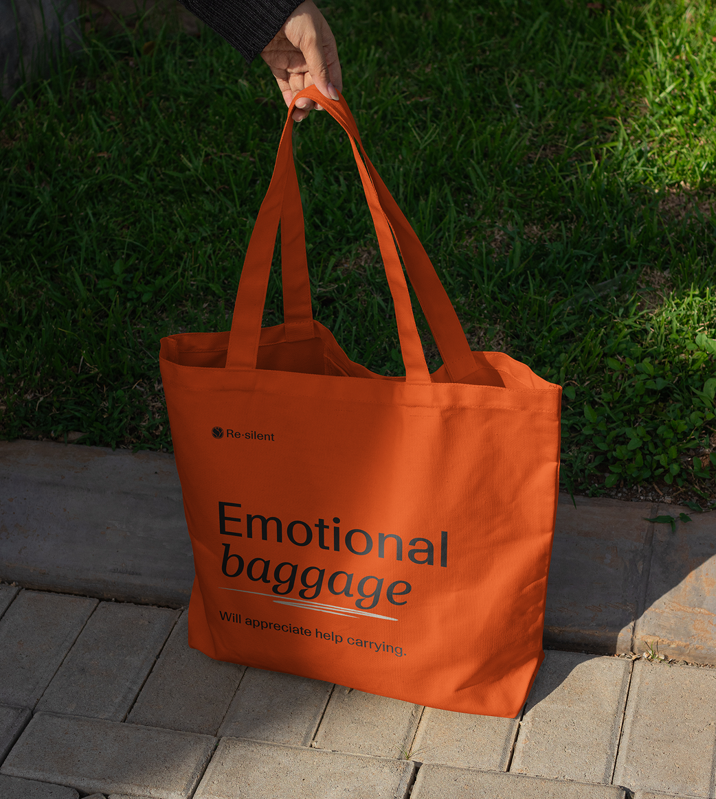
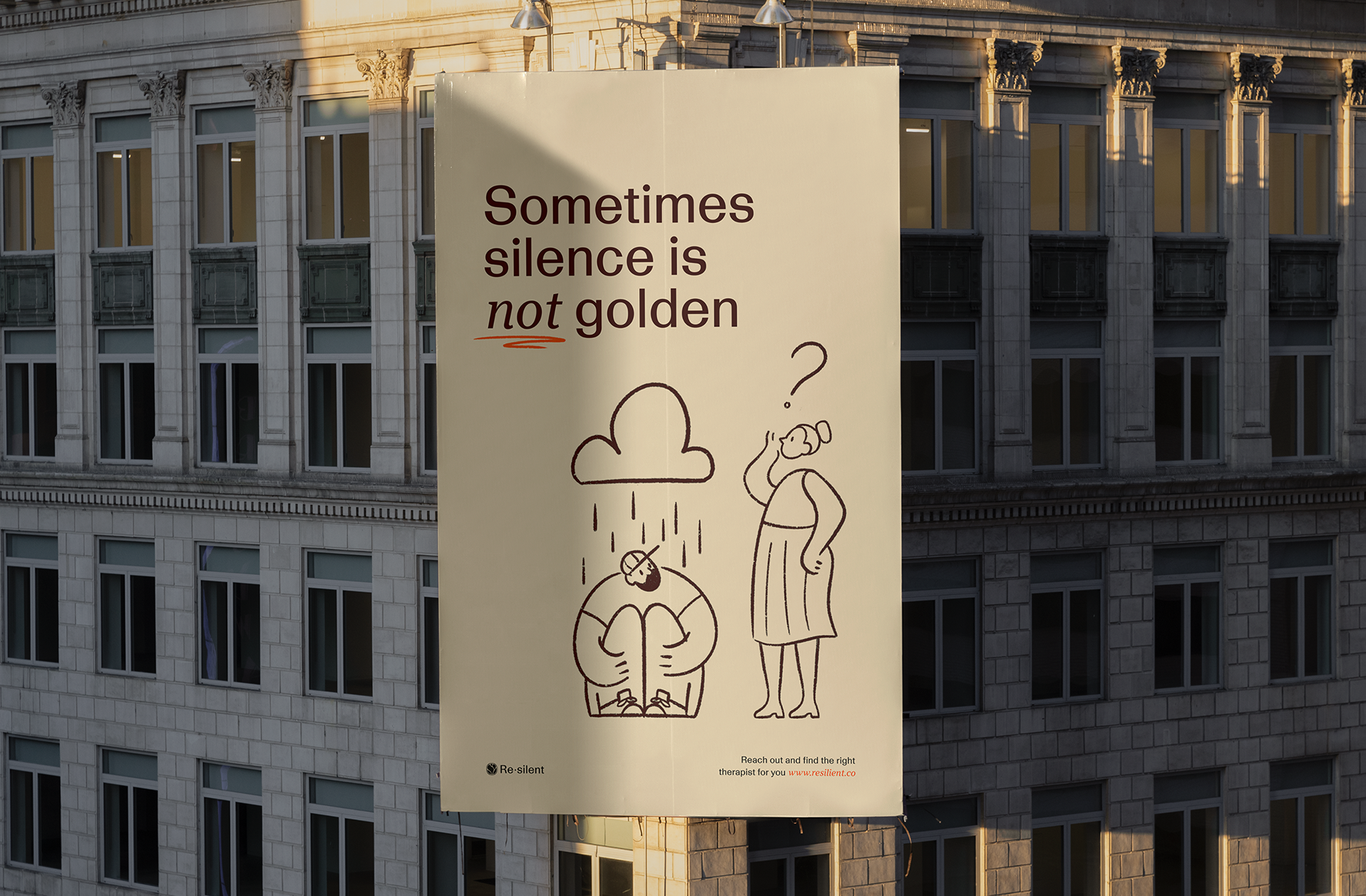
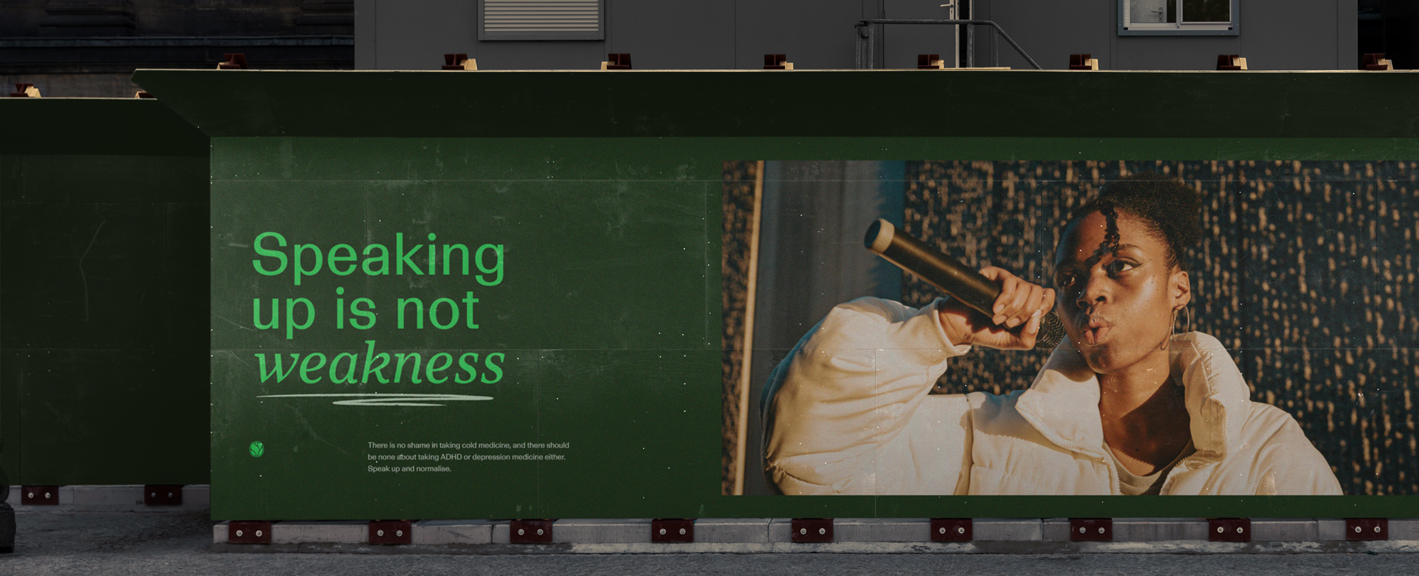
The Work [1]
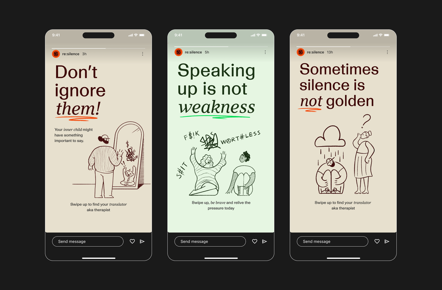
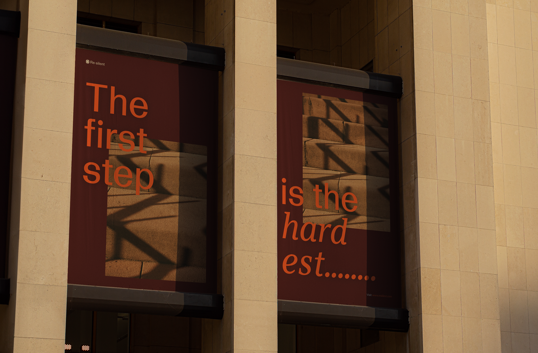
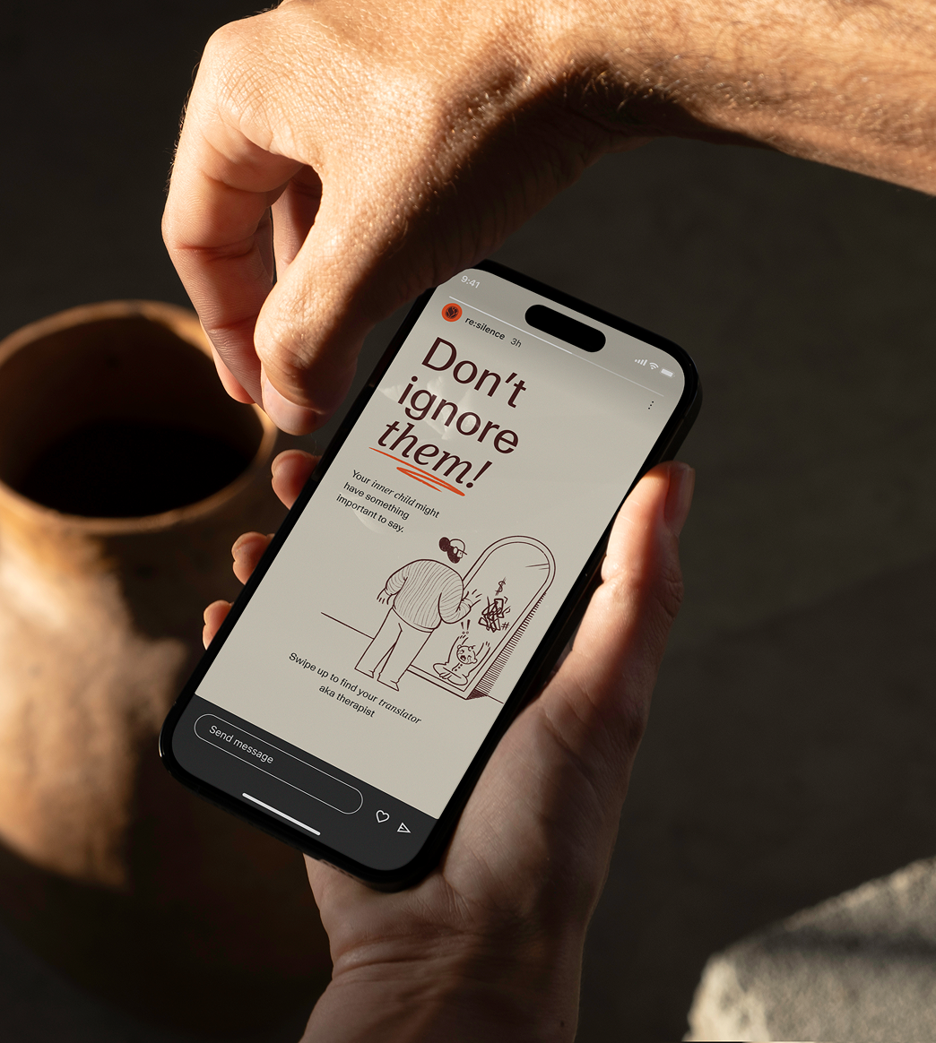
The heart of this project: the campaigns are built around headlines. They use humour and social context to capture attention. Combined with either photography or illustration, they tackle difficult subjects in an approachable way.
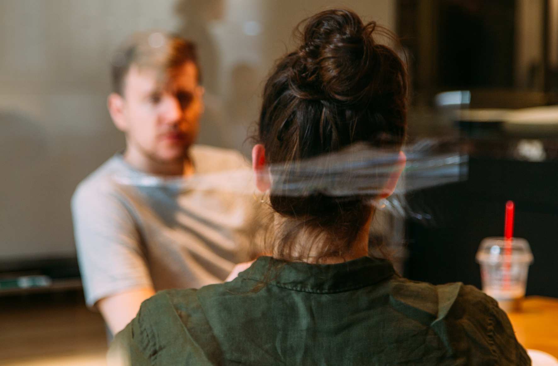
The Work [2]
The social animation was drawn frame by frame. At 12 frames a second. A rate that gave the old hand-drawn work its unique pacing. Capturing a quiet moment of vulnerability, the kind of scene that's hard to talk about but easy to recognise. They are slow to make in a space where everything moves fast.
The Landing
Re·silent led directly to illustration commissions that let me develop the hand-drawn style further. Many of the clients I've worked with since feel like they could have come from this concept, even when the visual approach we built for them is completely different.
Lets craft together
Is there an idea you would like to resonate?

2023 · Restimo
Crafting a brand as integrated as Restimo