Restimo · 2023
Crafting a brand as integrated as Restimo
Restimo is a B2B SaaS tool for restaurants. Through the years, they've evolved, changed, and the brand couldn't follow. They understood the problem they solved, but didn't yet know how to present themselves around it.
The Context
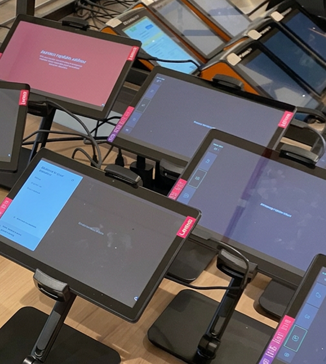
It all started as a QR-code menu app, but the team kept noticing a bigger problem: every delivery platform requires its own tablet, its own menu updates, none of it syncing. They pivoted to build one integration layer that connects everything. By the time they came to me, they were around twenty people, growing fast, and still wearing the brand of a completely different company.
The Decision [1]
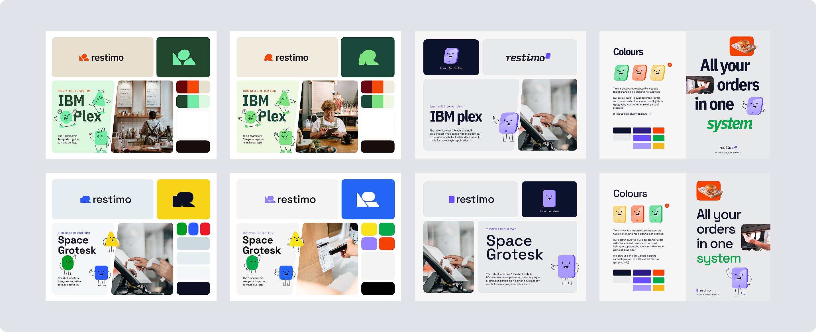
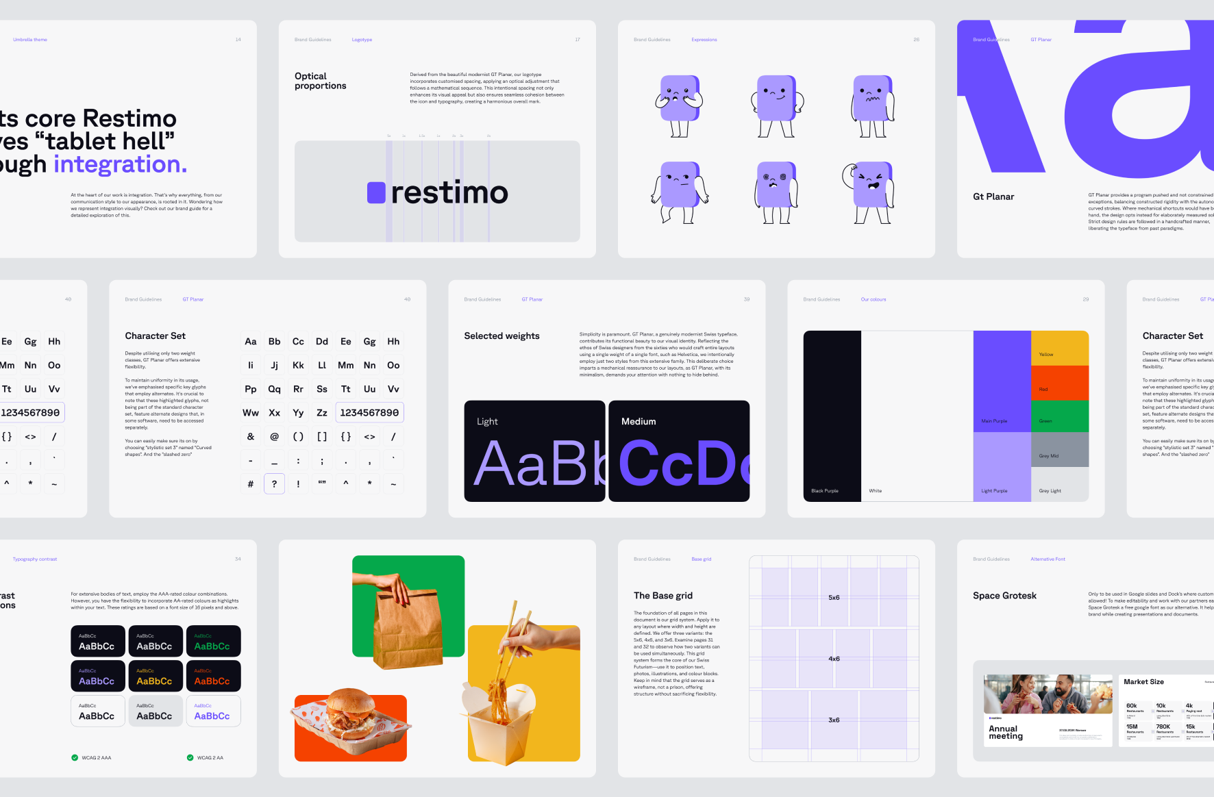
I developed three concepts for the brand. "Connection" felt too human, too B2C. "Bento box" was clever but too abstract. Integration was the clearest way to explain what Restimo does. That clarity shaped everything that followed.
The Decision [2]
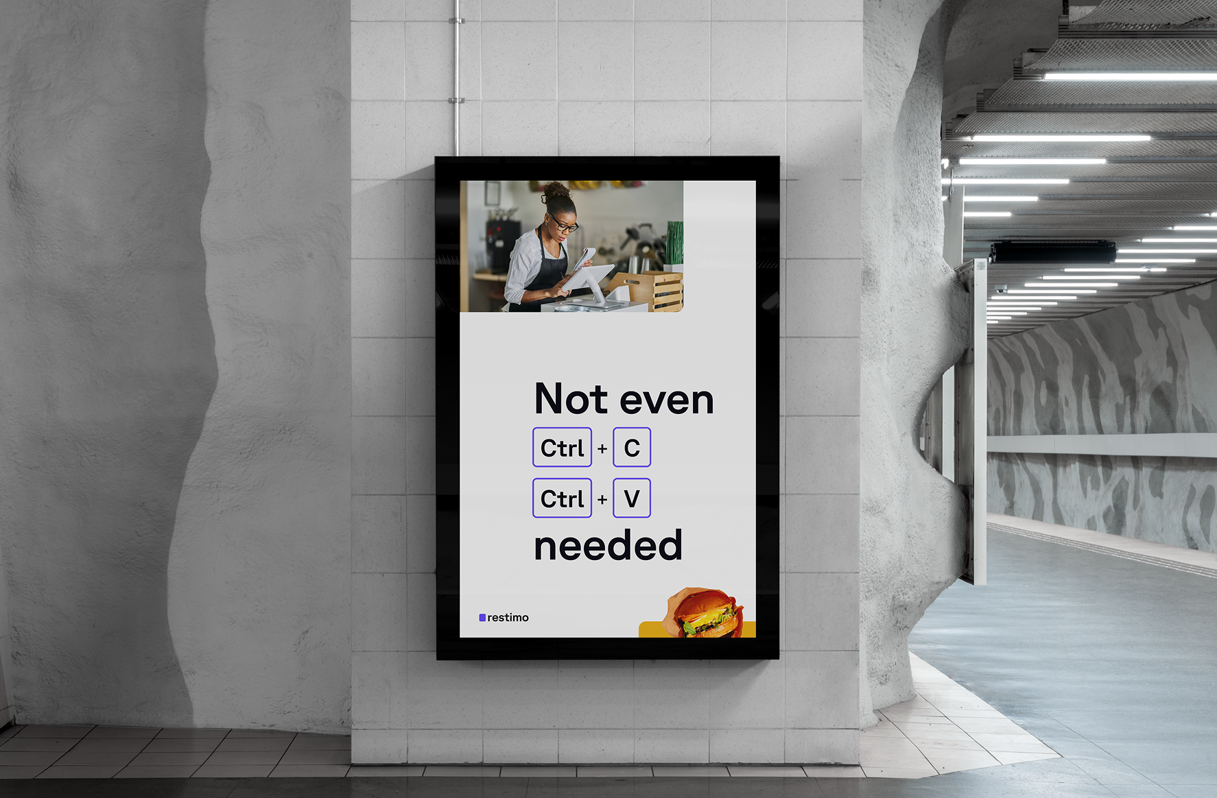
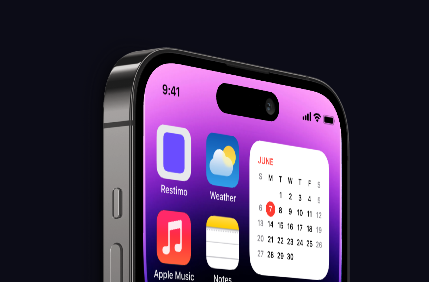
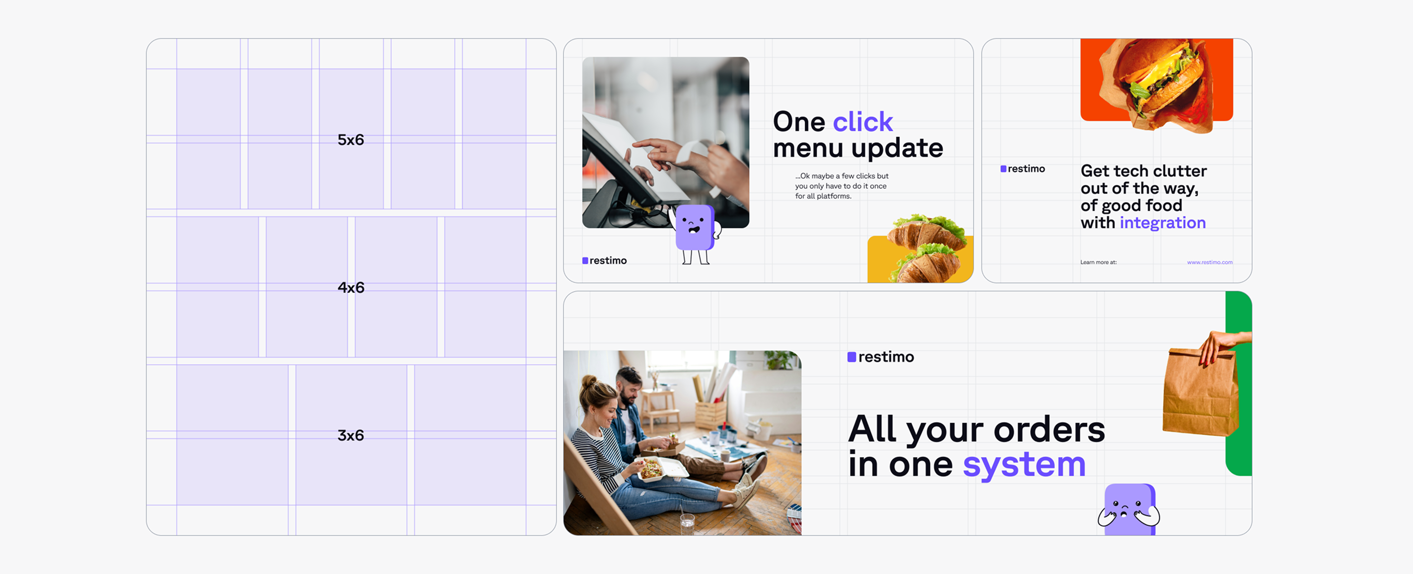
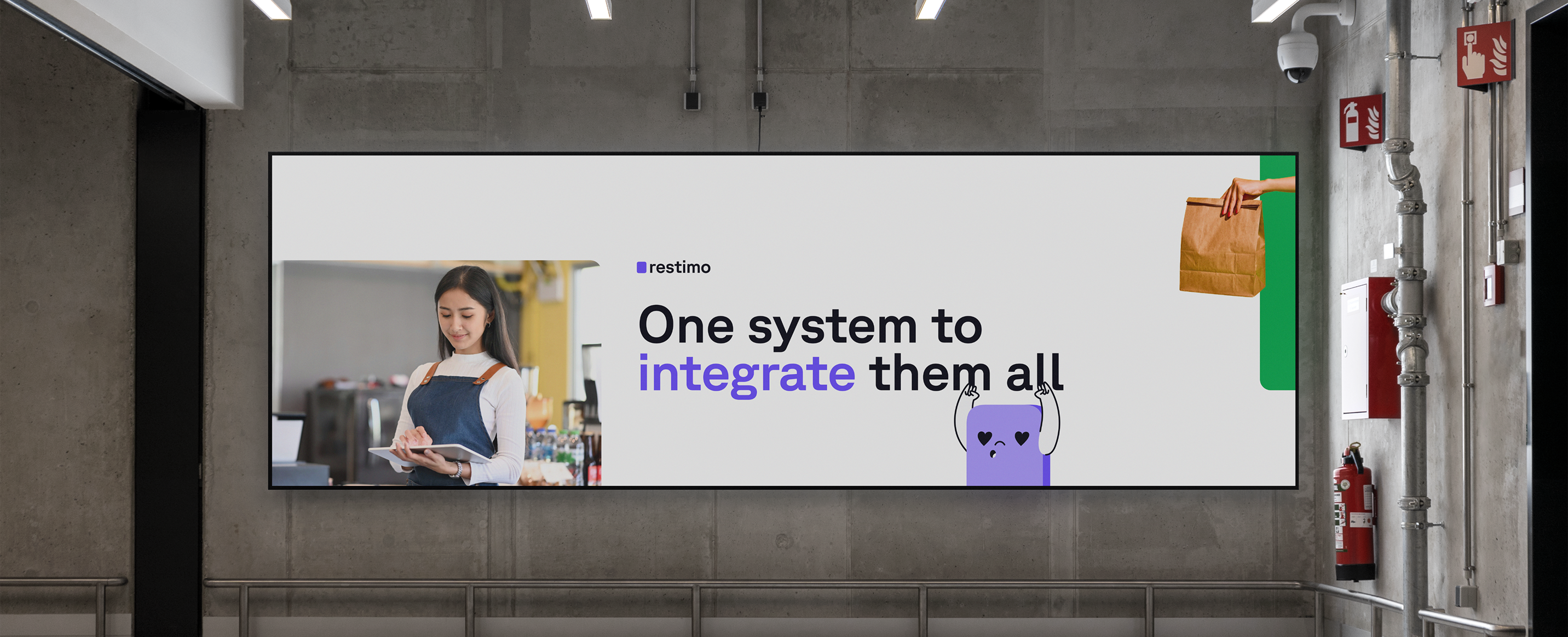
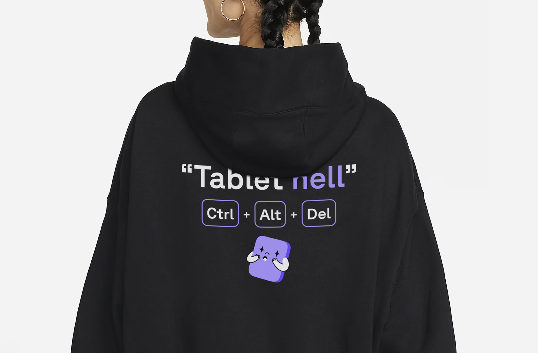
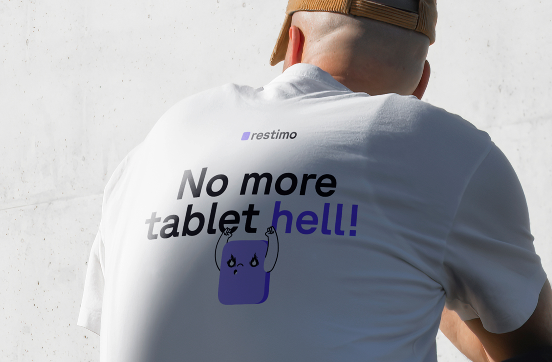
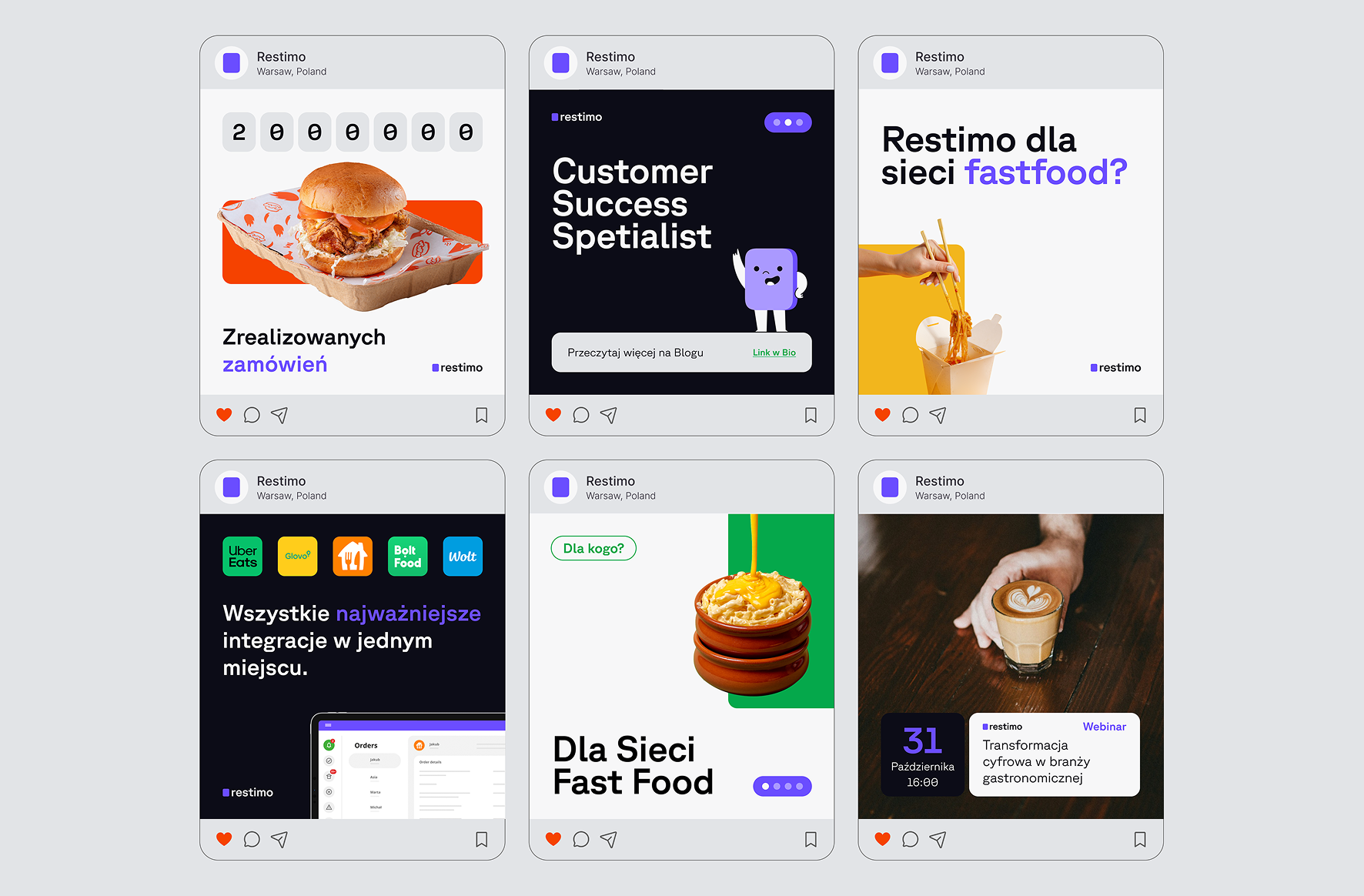
The wildcard concept. I had two solid visual directions when I pitched a third. The team kept coming back to the tablet, the one device that replaces the chaos. So I proposed a purple rectangle as the logo, literally the one tablet. It morphs into a character called Timo, named after Restimo, who becomes the brand's mascot. One slide, one visualization, one tablet.
The Work [1]
The identity centres on integration via a one-tablet concept. The visual simplicity of this direction required a high level of craft to make it read as refined. I paid close attention to the details: defining the few use cases where the icon works by itself, like a favicon or social media icon, and perfectly balancing it with the wordmark everywhere else.

The Work [2]
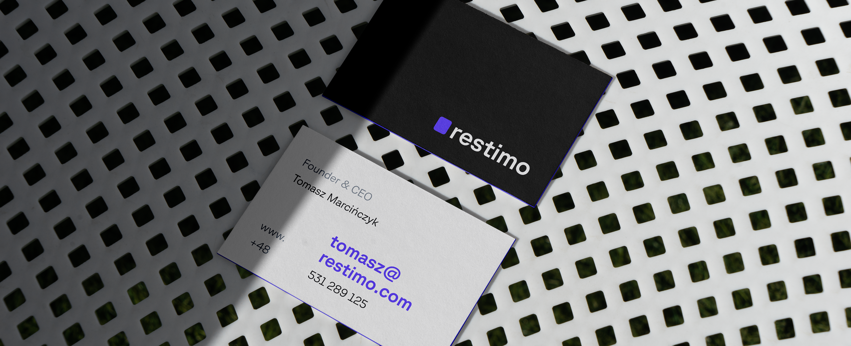
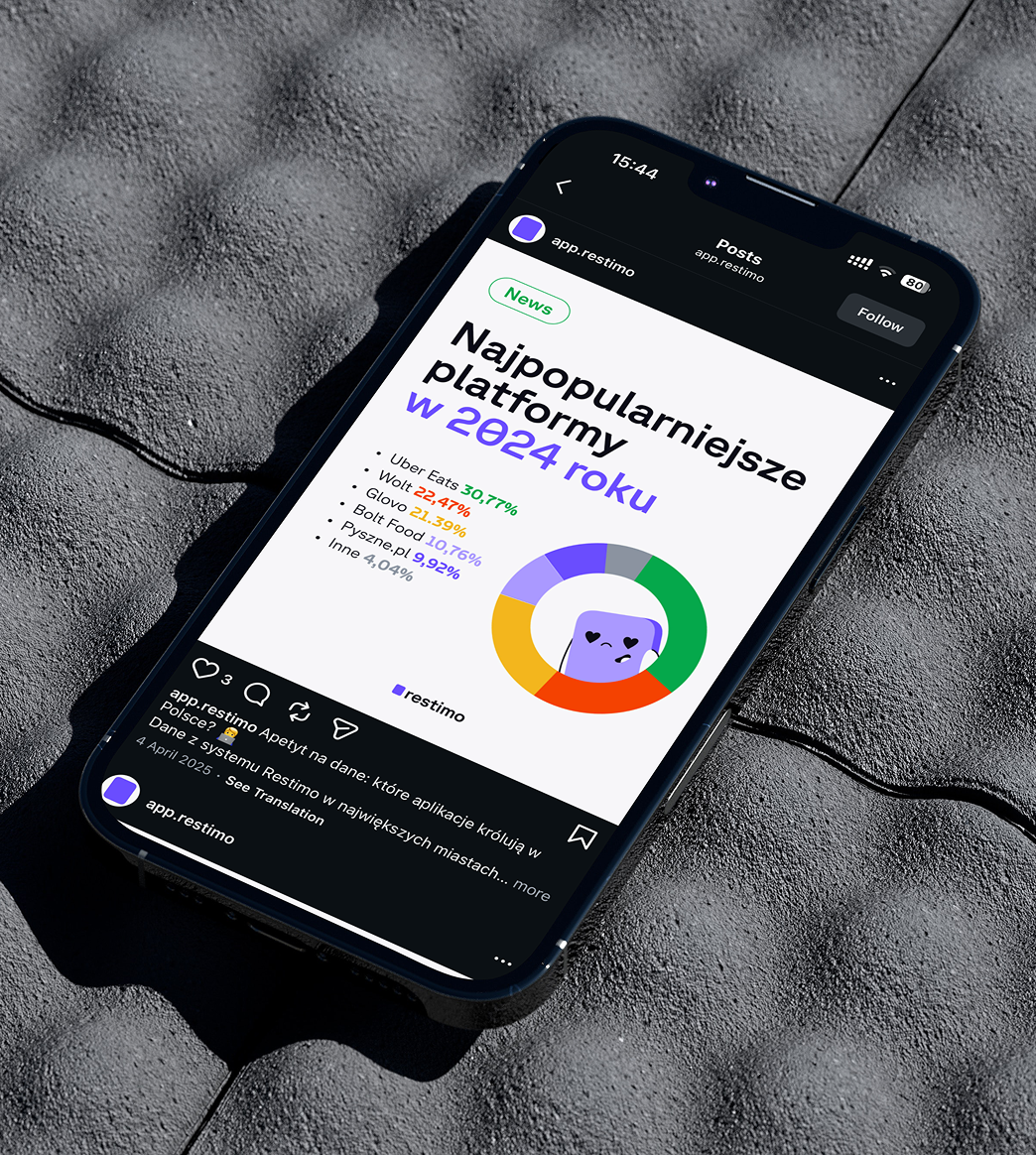
Looking at the colour space in the industry, I saw that purple was underused. That gave Restimo room to stand out without being compared to others. I evolved the existing shade and added three bright accents: red, green, and yellow, the colours of the delivery platforms Restimo connects.
The Work [3]
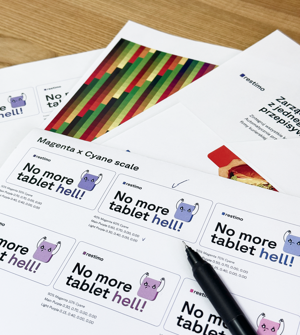
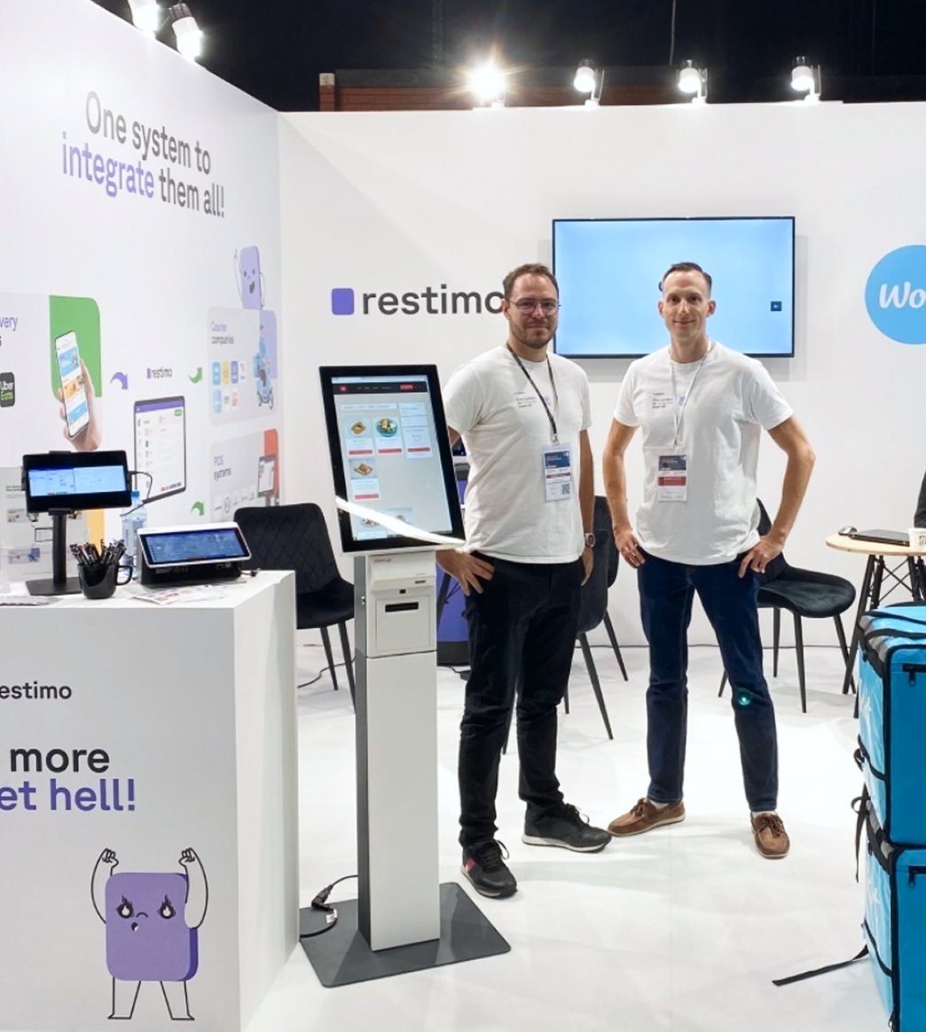
For many SaaS companies, print is an afterthought. Restimo meets clients face to face at sales visits and trade shows. They wanted the brand to feel just as strong in person. I spent days at local print houses getting the purple right across different methods.
The Landing
Two years in, this is one of the better-implemented brands I've done. The team now creates their own social graphics well beyond my templates, and they still look on-brand. That comes down to how I built it. Getting people beyond the founders into real decisions, planting the seed of ownership.
Lets craft together
Is there an idea you would like to resonate?

2024 · Re·silent
Imagining what a truly kind brand looks like