Agency 2012 / Żywiec · 2025
The key visual that brought Żywiec's brand together
Żywiec, one of Poland's biggest beer brands, needed a fresh key visual for its 2025 campaigns. Their brief: find a new use for elements within the existing brand and increase our brand consistency. Agency 2012 brought me in as a fresh pair of eyes. Originally hired for the exploration phase, my concept won the pitch, and we built out the full KV system.
The Context
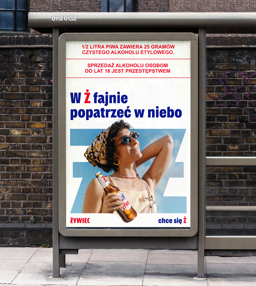
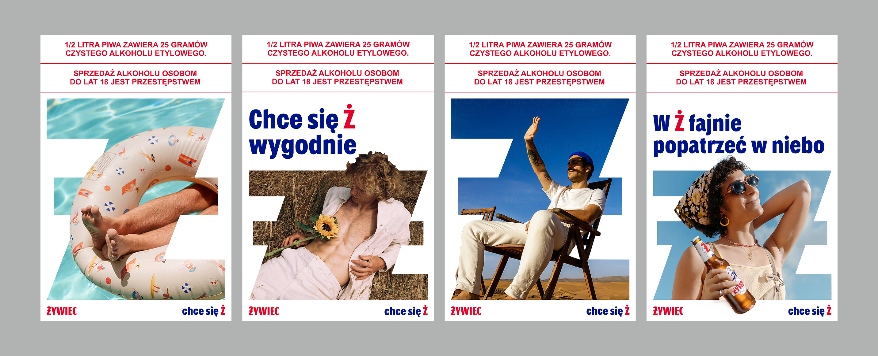
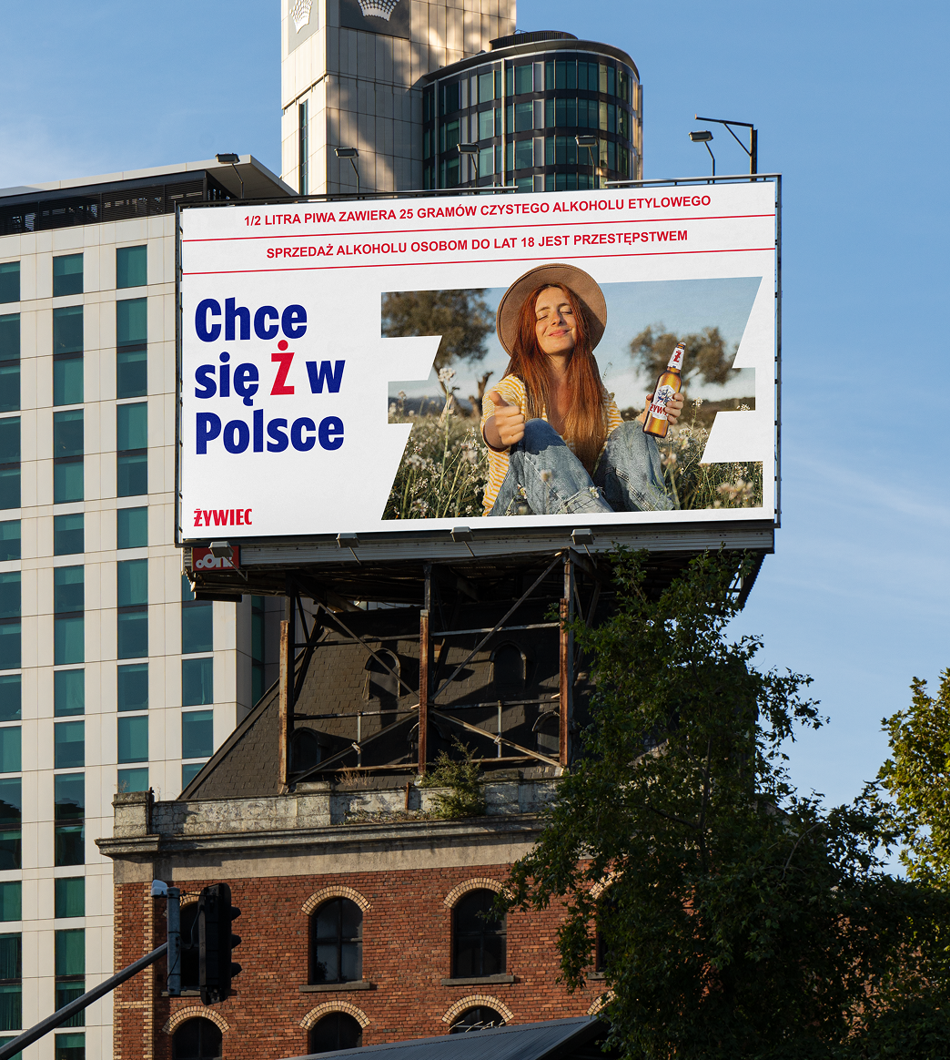
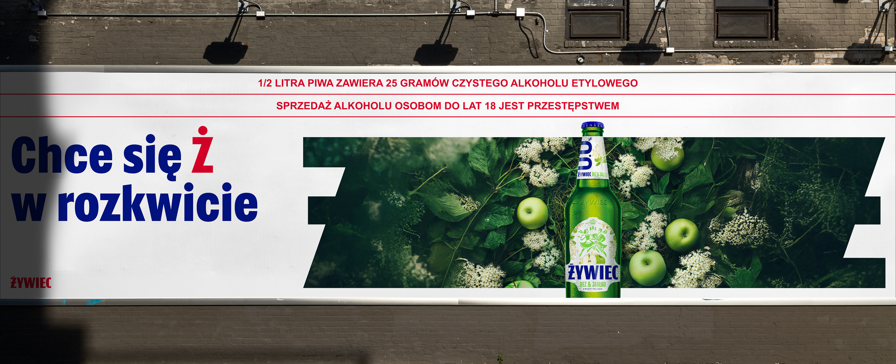
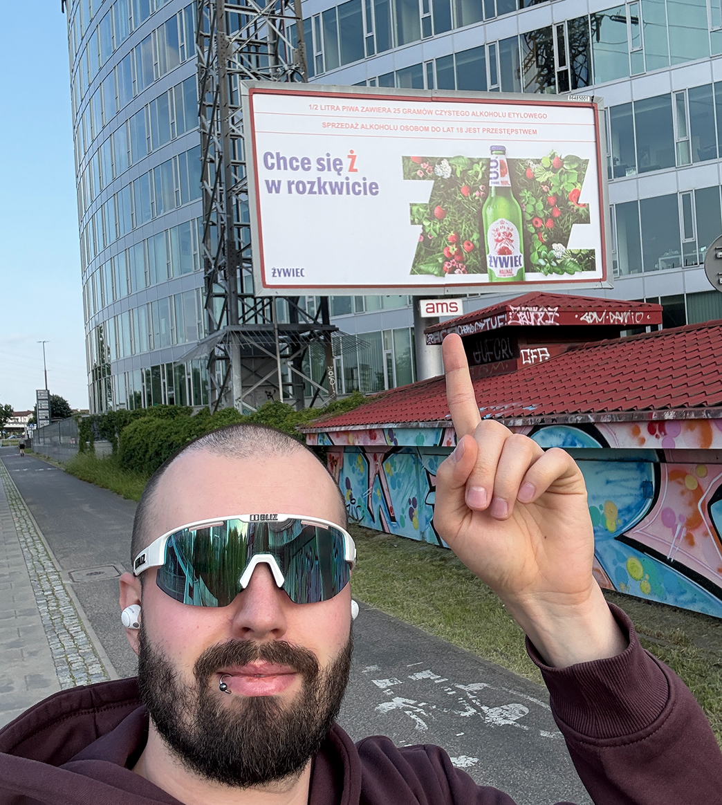
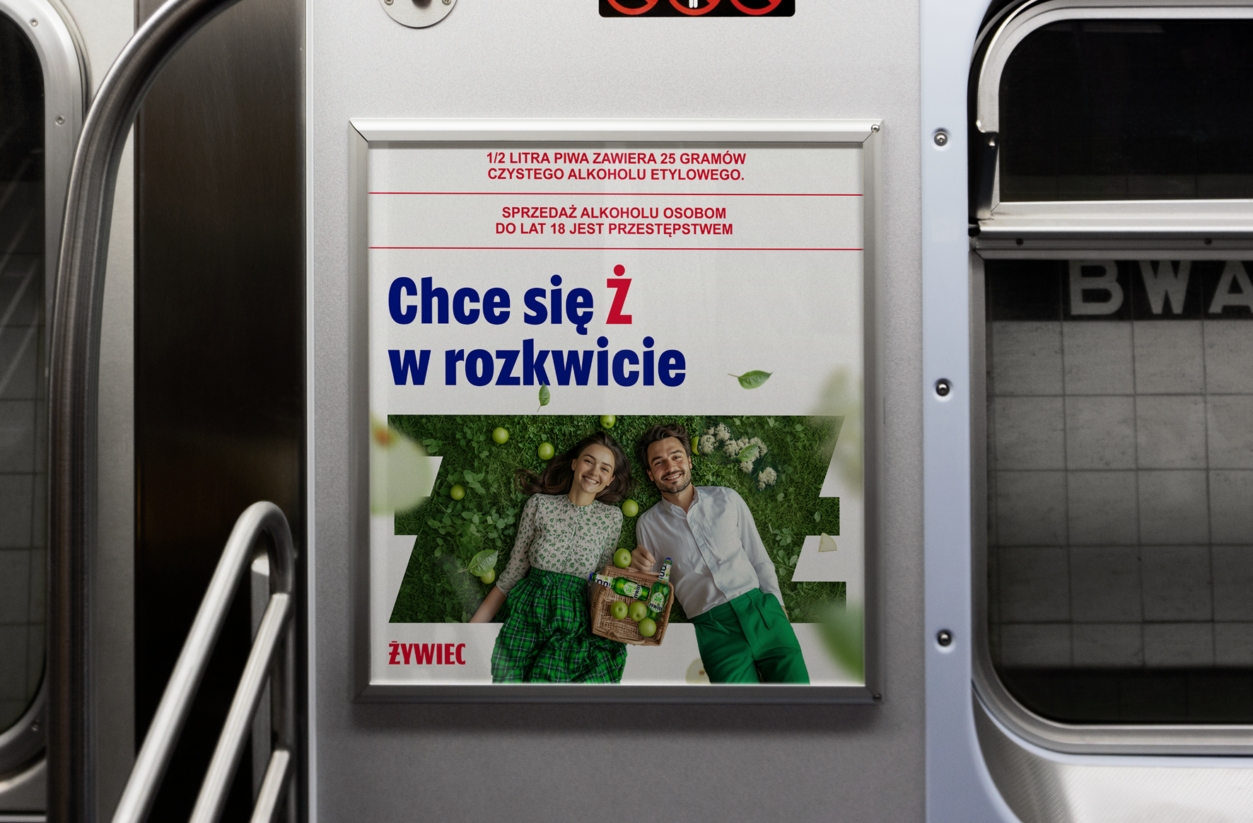
The KV needed to unite all their campaigns, be the red dot. Including the new campaign celebrating the Polish countryside, with new flavours inspired by Polish flowers. I found the unexplored gap. Żywiec had stunning photography and strong typographic billboards, but nothing that brought the two together. They have a rule: no typography on photography. So the brand's two biggest strengths, never shared a stage.
The Decisions [1]
I explored: abstract shapes pulled from the dancing pair weren't recognisable enough as brand elements. The detached elements, like the individual legs, were recognisable but only in the brand's existing colours. The Ż was different. It was the most iconic element in the system, and it carried real meaning.
The Decisions [2]
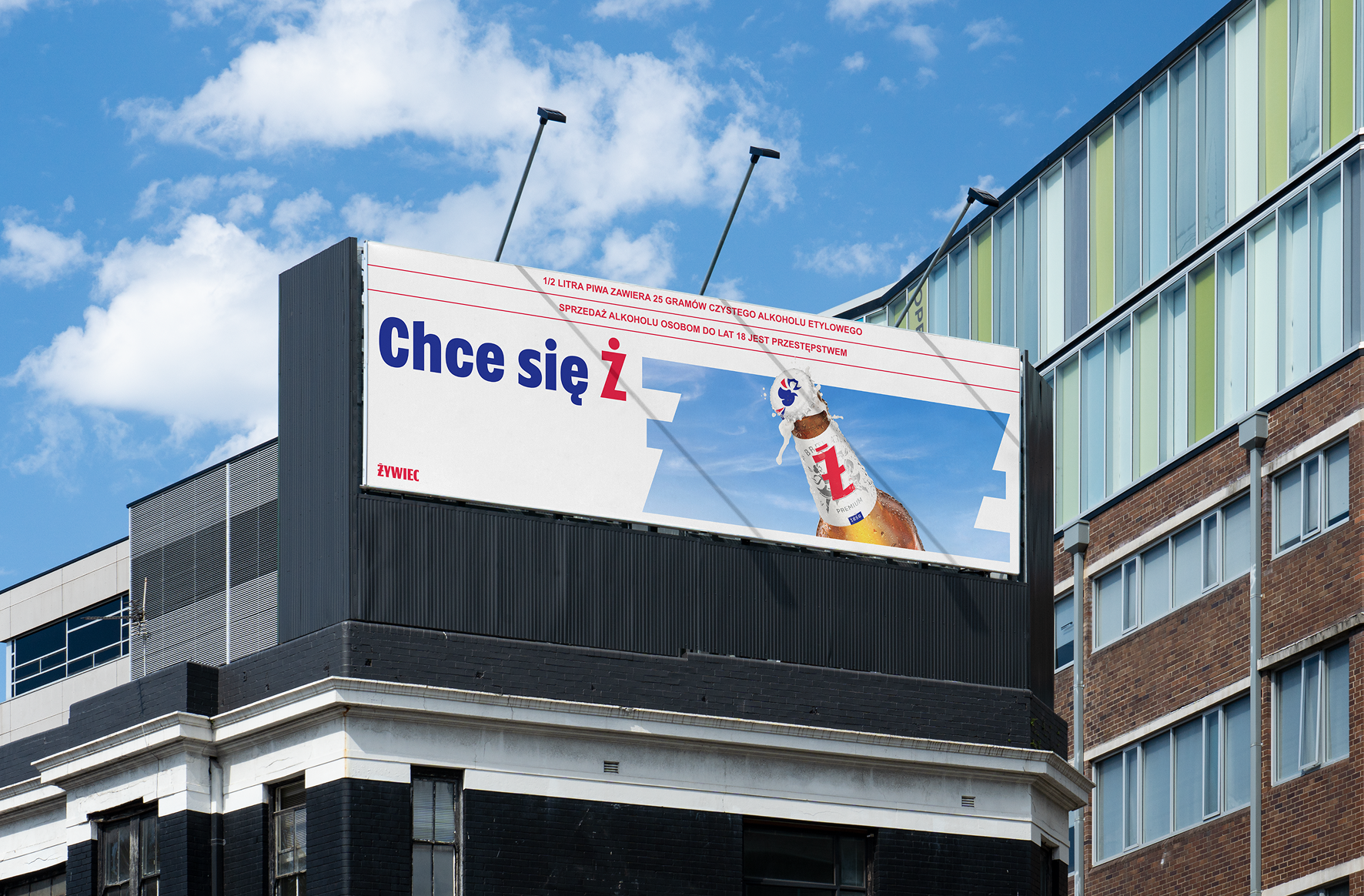
In Polish, life is “życie,” which starts with the same letter as Żywiec. Everything in life fits inside Ż. That was the core idea. To make it work visually, I took the Ż and turned it into a mask. Headlines could sit beside photography, not on top of it. Coexisting in a single layout. The agency director agreed this was the strongest concept, and took it to the client.
The Work [1]
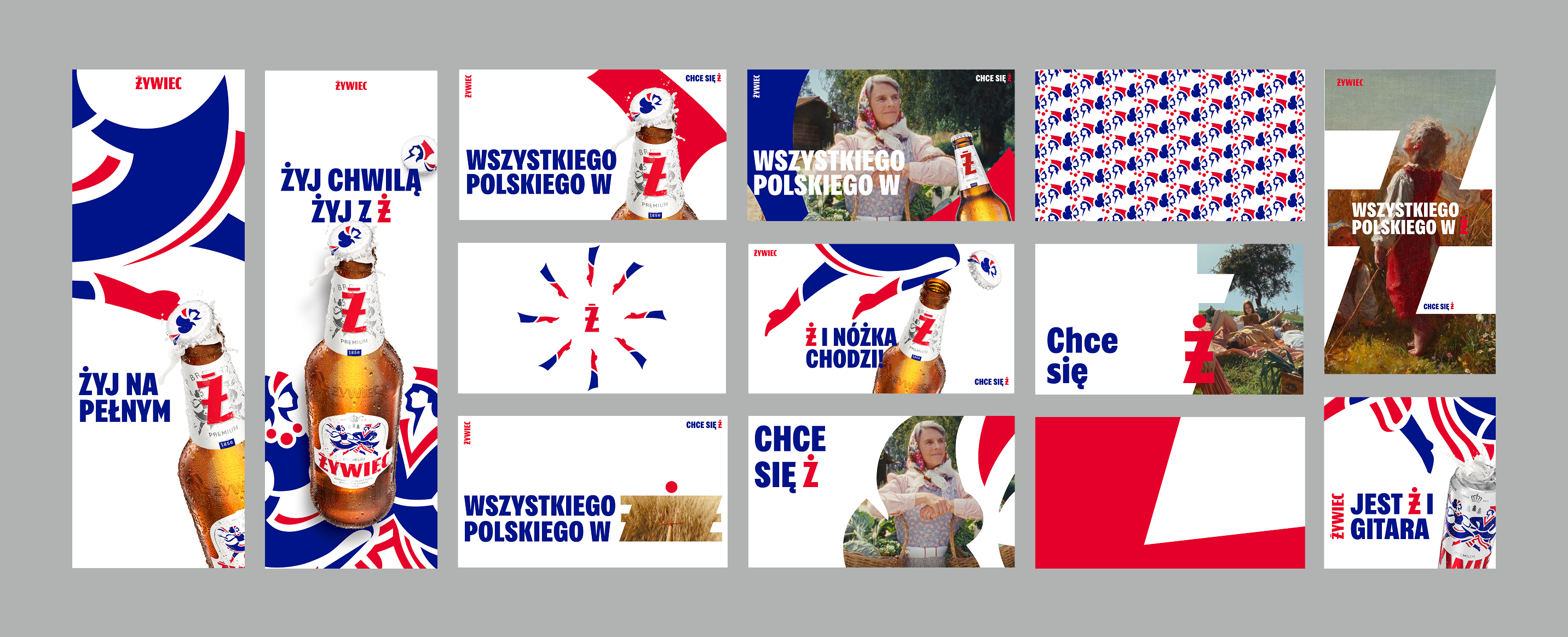
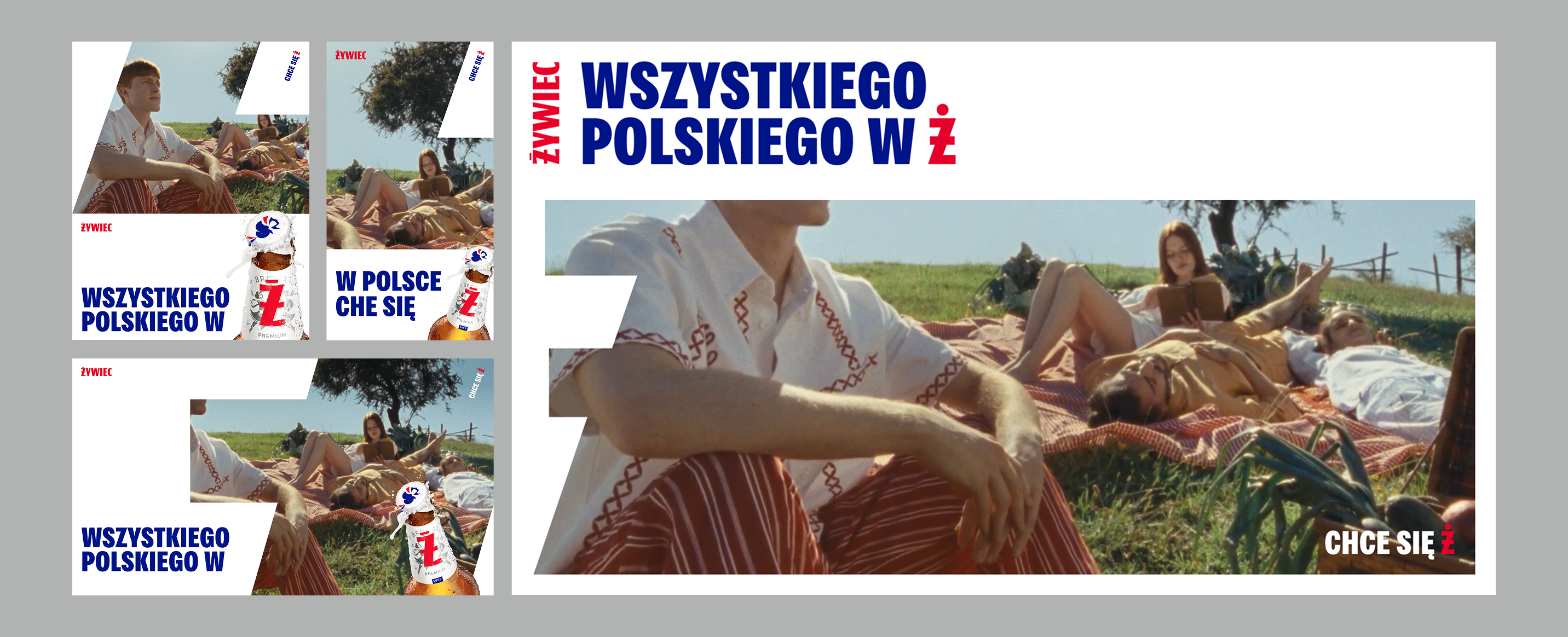
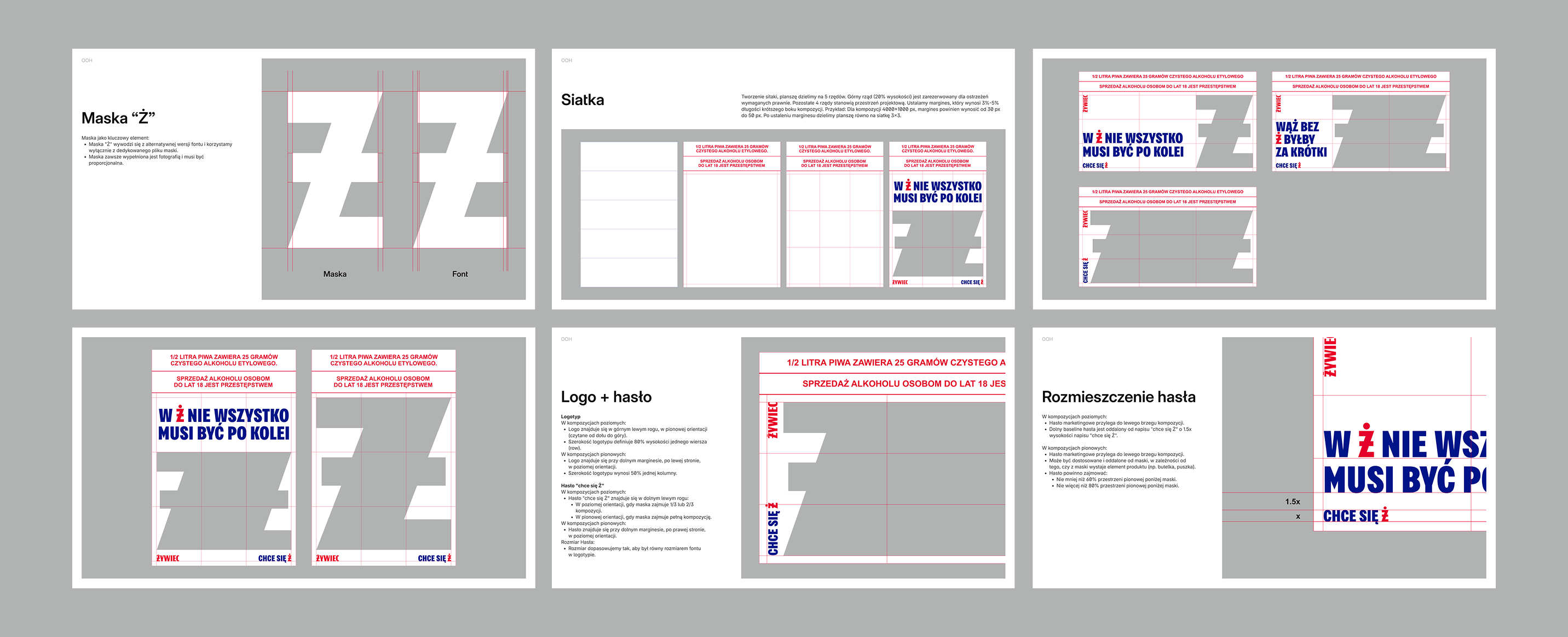
I built a grid system: three by three, percentage-based, with margins. No fixed sizes. It works at any aspect ratio. The grid also sets the rules for logo placement and the mini tagline that appears on every graphic. Ensuring consistency.
The Work [2]
For tall formats, the Ż could use the full grid or sit in the bottom two rows with copy on top. I pushed how far an image can escape the mask before it loses structure. Defined which edges of the Ż (the zigzags) need to stay clear for readability.
The Landing
My concept got selected, and it became the primary campaign visual for 2025 across OOH and digital. The toolkit I developed was picked up and used throughout the year by multiple agencies working with the brand. I've walked past billboards in Poland with this work on them. The individual executions weren't mine, but the visual system they're all built on is.
Lets craft together
Is there an idea you would like to resonate?

2023 · Restimo
Crafting a brand as integrated as Restimo